Goodreads redesigned
time 3 days | role UX/UI designer | tools Figma
Recreate the user interface of Goodreads to improve the app’s usability and match the brand’s identity
Goodreads
STEP 1 / heuristic analysis
Goodreads is the world’s largest site and app for readers and book recommendations. Its mission is to help people find and share books they love.
I conducted a heuristic analysis of the current app to check if something isn’t working and if I’m able to fix it with my redesign. The list was long, but I focused on the main issues:
no visual consistency (spacing, colors, typography, icons, alignment)
the search feature sometimes in 2–3 different places on the screen
no clear distinction between “Search” and “Discover” in the bottom navbar
confusing use of the word “Read” (past or present tense?), “List”, “Shelf”, “My books” and “Categories” (what is the difference between them?)
overwhelming content (too many elements, not enough white space, long scrolling, etc.)
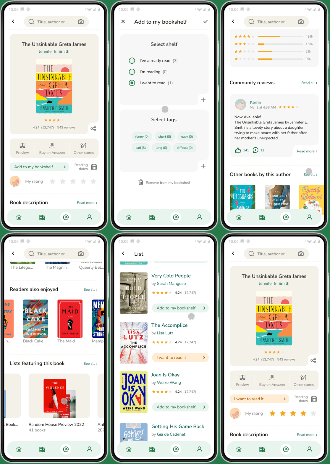
My redesign
STEP 2 / competitive analysis, style guide, hi-fi prototype
Afterwards, I performed a visual competitive analysis and document the color palette, typography, and visual elements of the product. I decided to change the font and soften the existing colors.
Once I had a clear idea, I started the redesign process. That’s how I solved the problems encountered during the heuristic analysis:
consistent spacing, icons, alignment, limited number of font sizes and colors
the search feature appears in one place on the screen
one button in the bottom navbar to browse books in the categories and lists
“Read” replaced by “I’ve already read”, “Shelf” and “My books” by “My bookshelf”
more white space, less scrolling, elements grouped by similarity


